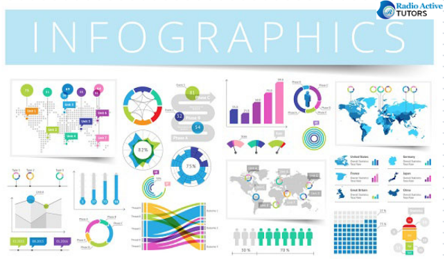
Infographic posters are powerful visual tools that enable the effective communication of complex data, information, or ideas. They combine text, images, and design to present content in an engaging and easy-to-understand format. Whether you're an educator, marketer, or simply want to convey information in a compelling way, creating an info-graphic poster can be a valuable skill. In this in-depth guide, we'll explore the step-by-step process of designing an infographic poster that captivates your audience, enhances comprehension, and effectively communicates your message.
1. Define Your Purpose and Audience
Before you embark on creating your infographic poster, it's essential to define your purpose and identify your target audience. Understanding your goals and the needs of your audience will shape the content, tone, and design choices you make throughout the design process.
Purpose:
Are you aiming to educate, inform, persuade, or entertain?
What message or key takeaway do you want your audience to retain?
Consider the overarching goal of your poster: What are you trying to achieve?
Audience:
Who is your target audience? What are their demographics, interests, and preferences?
What level of prior knowledge or expertise does your audience have on the topic?
How can you tailor your content to resonate with and engage your audience effectively?
Having a clear sense of purpose and understanding your audience's expectations is the foundation upon which you'll build your infographic poster.
2. Gather and Organize Content
The next step involves compiling and organizing the content you intend to present. This may include data, statistics, facts, a narrative, or a combination of these elements. Your content should be organized into a logical and coherent structure that guides the viewer through the information while maintaining their interest.
Content Organization:
- Create a clear hierarchy of information, starting with the most critical analytical points.
- Develop a narrative flow, ensuring a smooth transition from one piece of information to the next.
- Use headings, subheadings, and bullet points to structure your content.
Remember, less is often more in infographics. Be selective and focus on the most relevant and compelling information. Avoid overwhelming your audience with excessive data or details.
3. Choose a Layout
The layout of your infographic poster is a critical decision, as it dictates how your content is presented. There are several layout options to consider, depending on the complexity of your content and your design preferences.
- Single Infographic Layout:
In this approach, a single, large infographic takes center stage on the poster.
The entire message is conveyed within one cohesive design, allowing for a clear and straightforward presentation.
If your content is extensive or covers multiple aspects, consider using a multi-section layout.
Create distinct, interconnected infographics that flow together, guiding the viewer through various facets of the topic.
Ensure a logical progression from one section to the next, maintaining a cohesive narrative.
Your choice of layout should align with your content and the level of detail you wish to convey.
4. Design Visual Elements
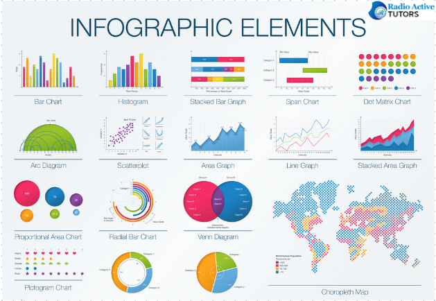
Visual elements are the heart of any infographic poster. They enhance the visual appeal and help convey information efficiently. These elements may include icons, images, charts, graphs, illustrations, and more.

Visual Element Guidelines:
- Choose visuals that are relevant to your content and reinforce your message.
- Ensure high-quality and resolution for all images and graphics.
- Maintain a consistent visual style throughout your poster.
- Implement a color scheme that complements your content and engages the viewer.
Visuals play a vital role in capturing your audience's attention and conveying information effectively. They should be used strategically to support and enhance your content.
5. Establish a Color Scheme
A well-chosen color scheme can significantly impact the visual appeal and effectiveness of your infographic poster. Colors can be used to convey meaning, create contrast, and guide the viewer's focus.
Color Scheme Tips:
- Select a color palette that aligns with your purpose and audience.
- Use contrasting colors to highlight key information or draw attention to specific elements.
- Ensure that your color choices enhance readability and accessibility.
Consistency in color usage is vital to maintain a harmonious and visually engaging design. Consider using color psychology to evoke specific emotions or associations, depending on your content.
6. Typography and Text
Effective typography is crucial for readability and comprehension. Choose fonts that are easy to read and complement your overall design. Consider the following:

Typography Guidelines:
- Use a combination of font sizes and styles to differentiate headings, subheadings, and body text.
- Ensure that your text is legible at a glance and from a distance.
- Keep text concise and to the point, using short statements and bullet points.
Clear and well-organized text is essential to convey your message effectively. Maintain a consistent typography style to ensure a cohesive visual identity.
7. Create a Visual Hierarchy
A visual hierarchy guides the viewer's eye through your infographic poster, emphasizing the most important information and the intended flow of content.
Establishing Visual Hierarchy:
- Place the most crucial elements prominently in the design.
- Use design elements such as size, color, and position to indicate importance.
- Ensure that your content follows a logical progression, with elements flowing seamlessly from one to the next.
By creating a well-defined visual hierarchy, you help your audience navigate your poster with ease and understand the content in the intended order.
8. Add Labels and Captions
Every visual element on your infographic poster should be accompanied by appropriate labels or captions. These provide context and explanations, enhancing the viewer's understanding of the content.
Labeling and Captioning Tips:
- Ensure that each label or caption is clear, concise, and informative.
- Use a consistent format and style for all labels and captions.
- Avoid clutter by placing labels strategically to minimize visual distractions.
Clarity is paramount in labels and captions, as they bridge the gap between visuals and text, making your poster self-explanatory.
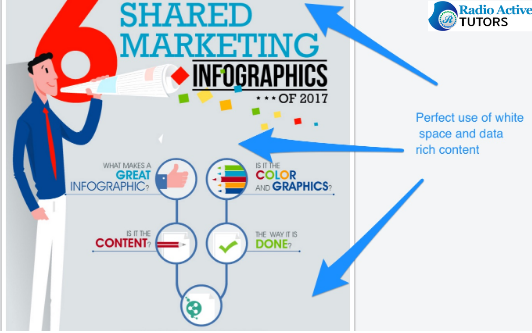
9. Use White Space
White space, or negative space, is the unoccupied area around elements on your poster. It plays a crucial role in improving the overall design, readability, and visual appeal.

White Space Considerations:
- Allow ample white space around elements to prevent visual clutter.
- Use white space to create a visual separation between different sections or components.
- White space enhances the viewer's focus and understanding of the content.
White space should be seen as an essential part of your design, not merely empty space. It contributes to the poster's overall balance and aesthetics.
10. Test and Review
Before finalizing your infographic poster, it's essential to step back, review your work critically, and make any necessary revisions. This stage involves evaluating your design for various aspects, such as content, readability, visual appeal, and alignment with your goals.
Testing and Review Process:
- Check for overall consistency in design elements, color schemes, and fonts.
- Ensure that your poster effectively communicates your intended message.
- Consider gathering feedback from peers or colleagues to gain different perspectives.
Testing and reviewing your poster can help you identify areas for improvement and refine the final product.
11. Finalize and Export
Once you're satisfied with your design and have made any required adjustments, it's time to finalize your infographic poster. This involves saving it in the appropriate format for your intended use.
Finalization Steps:
- Save your poster in a high-quality format, such as PDF, JPEG, or PNG.
- Ensure that the resolution is suitable for your printing or digital sharing needs.
- Create a backup or archive of your design files for future reference.
Your finalized poster should be ready for printing or digital distribution. Make sure that it meets the technical specifications for your chosen platform.
12. Print or Share
The last step is to distribute your infographic poster to your intended audience. Whether you plan to print it for physical display or share it digitally, consider the following considerations:
Printing:
- Ensure that your poster's dimensions and resolution are appropriate for your selected printing method.
- Verify color consistency and quality before printing.
- Proofread the poster one final time to catch any errors.
Digital Sharing:
- Choose the right digital platform for sharing, such as social media, websites, or presentations.
- Optimize your poster for web use by compressing image files and ensuring compatibility.
- Consider creating multiple versions to accommodate various screen sizes.
Your infographic poster is now ready to engage and inform your audience, effectively convey your message through a visually appealing and accessible format.
Conclusion
Creating an infographic poster is a multifaceted process that requires careful planning, design expertise, and attention to detail. By defining your purpose and audience, organizing your content, making informed design choices, and following the steps outlined in this guide, you can produce an infographic poster that captivates, educates, and effectively communicates your message. Whether you're an educator, marketer, or communicator, the power of infographic posters can be harnessed to visually convey information in an engaging and memorable way.
